Showing posts with label itty bitty accents punch pack. Show all posts

Saturday, 2 July 2016

Christmas in July


I'm making my Christmas cards at the moment. I like doing them now rather than later in the year because I have the luxury of time that I know I won't have later in the year. I can take time to experiment & play & make each card individual. If I only make one card in a session that's fine - come October time I'd be having to mass produce one design to get them all done, & I don't really enjoy doing that.


For this card I've used the Peace This Christmas stamp set (141570) from the new annual catalogue. I like the font & the foliage so it's great for cards where you want to make the text the focal point.

I've teamed it with the This Christmas paper pack (141628) which reproduces some of the images found in the stamp set. The colors are Garden Green, Basic Black, Very Vanilla and Cherry Cobbler. I've also used the Layering Circle Framelits (141705) to cut out and back the sentiment.

One thing I noticed was that the flower punch from the retired Itty Bitty Accents Punch pack cuts out the poinsettia from one of the stamped images - great for layering up & creating dimension, so dig it out & use it with this stamp set if you have it.


I used the Bow Builder Punch (137414) for the bow. It adds a nice touch but bulks up the depth of the card, so I'll be hand delivering this rather than mailing it.

Sunday, 10 May 2015

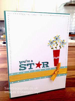
Clean and Simple card using the Pictogram Punches stamp set (& video tutorial)


clean and simple card pictogram punches

This handmade card features Stampin' Up!'s Pictogram Punches stamp set, which is being carried forward into the 2015-16 annual catalogue (out 2 June 2015). Hurray!

Like all good stamp sets, it has a set of coordinating punches - in this case, the Itty Bitty Accents punch pack, which consists of star, heart and flower punches.

Do you like the paper piercing round the edge? It adds a bit of interest and texture to white space. There's a new template for that in the new catalogue too.

When designing this card I used the principle of splitting the card into thirds. Apparently the eye naturally finds items placed where the thirds of the page intersect, pleasing. So the vase is at (roughly!) 2/3 across the card, and the sentiment & ribbon are roughly 2/3 of the way down. 

I made a video showing step by step how I made the card. Apologies for the poor light. I wasn't filming in my usual place, and it turned out darker than I'd anticipated!


If you'd like to purchase anything featured in this video, here's what I used:


Built for Free Using: My Stampin Blog


Sunday, 27 July 2014

Decorative star mask bokeh (video)

I've been messing around with masks today. At £2.75 for the two, the Hearts & Stars decorative masks are a bargain.


I accidentally stumbled on an effect similar to bokeh, in photography. Bokeh is "...the aesthetic quality of the blur produced in the out-of-focus parts of an image produced by a lens". Of course it is.

If you know your way around a camera you can create the effect yourself. Since I take most of my photos on my iPhone, I just use an app, Bokehful, to add the effect in later. I've used it round the edges of the photo above.

You create the effect by applying ink lightly through the mask, then going back in in certain areas with a heavy application. I used Real Red, Crisp Cantaloupe and Bermuda Bay. 


It's quick, & makes a really pretty background for a card.

Stand by for an instructional video:


Items featured: